To be honest i really want to move on from this part. I have sat on it for a year and feel frustrated as so much has happened in my home life leaving me with very little time to work on this. I had so many ideas in my head about how i would present this and the work i would do and feel disappointed as i am not happy with the work i’ve done. I think from now on I will think less and be more productive in a step by step way instead of reading through the whole project way in advance and making elaborate plans. I am pleased with how the yarn wrap came out , in particular the section focusing in the womans back and hair, in pinks, creams and pale green. I am finding that quite a large volume of thinking, gathering and working needs to be done in order to come out with one piece of work that i am happy with. With reagrds to the final presentation of selected work, i am happy with the yarn wraps and colour extension. By the time I got to the watercolour and collage i really felt i had been almost trapped inside this project and just want to move on. I struggled with it not being so textile related but ithink if i came back to it at a later date, not feeling so stuck and rushed I would get more out of it.
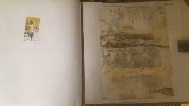 I am happy with this simple collage of the corner of lace piled up. Its very textural and i find the colours pleasing. I have decided i do prefer neutral natural colours, of the earth, sky, forests and stone.
The book that i made took a long time to decorate the cover, having painted papers, then tearing and gluing, repainting and adding sparkley bits and I would have been better spending that time on the content! I did enjoy making the book cover but on reflection something simple would work better as it is not conected with the content at all I just wanted to make a colourful paper collaged book cover which i am not all that thrilled with as it has no context.


The watercolour project was enjoyable and although i felt rushed and didn’t spend the time id liked to on it i did learn something as although i have worked with watercolours before ive not tried to keep a record of which colours i am mixing in order to reproduce them exactly at a later date. I found it difficult to be structured and note how to mix the colours. The guache paints were easier to keep track of what i was using and what proportion. Because the shades of the glasses were so varied yet similar i ended up just getting into it in a relaxed way and mixing as i went on a large pallet. letting the colours run into each other on the pallet was pleasing and produced a good array of similar tones.
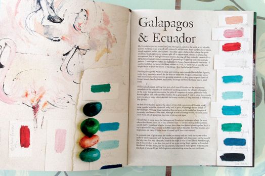
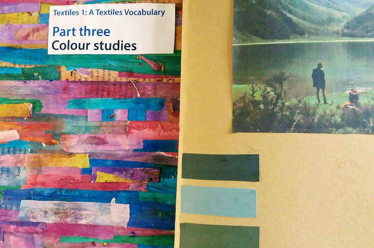
 I was happy with the yarn wraps, i really enjoyed working on them and look forward to working with these gorgeous colours further. Perhaps some colour chips alongside and better quality enlarged images would be better.


Some labels alongside the colour extension chips should have been included. I have notes of these in my sketchbook. I enjoyed this using gauche, it has a glorious pure texture and it straight forward to mix colours. I was surprised how many colours are in what looks like a really simple print. I collected a number of fabrics for this project, contacting suppliers for samples and getting lost in internet images. I really am drawn to vintage pieces and also anything which draws its references from the past. I spent a lot of time reading about Morris prints and the history of the designs and thinking about how innovative the print and dye processes were for the time. I love the colours produced by woad and indigo in particular and would like to look into all this further at some point. I am drawn very much to finding out more about dyeing processes, natural plant dyes, eco printing etc. I grow a lot of plants and am interested in herbs and wild plants/’weeds’ and would like to investigate their uses in textile art.
 I should have included colour chips alongside the collages. It would also make them easier to use as a starting colour reference at a later date.
Overall, Although I don’t feel i put my all into this project, it didn’t resonate all that well with me and as it sat around for so long i am keen to start the next project. I do feel it will be a useful and inspiring colour resource for future projects on the whole though.
As usual i spent a respectable amount of time trawling happily on pinterest and totally wish i had created something like Sibella Courts interior design colour resources. She has such a gift with using colour to create moods. I wish i had been more inventive and produced a colour resouse book that was more arty. I think mine looks quite naive.